

Spotify - Add A Feature
I developed a feature on Spotify that allows users to set filters to create AI generated playlists in seconds.
TIMELINE
1 Month
TOOLS USED
Figma, Adobe Illustrator
Summary and Impact
I chose to add an AI feature to Spotify in which you can create playlists based on BPM, tempo, artist, genre/subgenre - you can get as granular and detailed as you want. Additionally, each song would have a section underneath with info such as BPM, tempo, equipment and such which would be very useful to DJs, playlist curators, etc. (These features will also be searchable).
I myself am a pilates instructor and runner, and when I’m making playlists for my classes I like to make sure the music is all within the same tempo/BPM range for my clients.
Research
I interviewed 8 different candidates with varying professions and lifestyles, and found that most are satisfied with their current music streaming platform of choice, but it could be better. Spotify users stated that the platform’s playlists tend to be the same and the algorithm keeps showing them the same songs/artists. The platform also provides no information on tempo, which is important for users like fitness enthusiasts and DJs.
My market research supported this as well. I compared 4 different music streaming platforms (Spotify, Apple Music, Soundcloud, and Youtube Premium), and found that none of them offer an *AI generated playlist feature.
I concluded that my product needs to be highly informative and needs to pull research from millions of different listeners across the world.
*Spotify now has this in a Beta version.
Personas
My two main personas for this project are the Casual Listener and the The DJ


User Flow
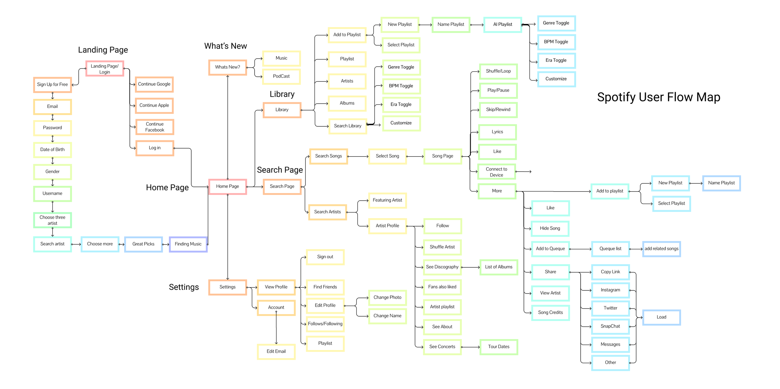
I’m not reinventing the wheel here. My feature needs to follow the general flow of Spotify’s already spectacular interface - it’ll just add that much more value.
Key Screens


The dropdown filters upon searching make finding the perfect song (and curating the perfect playlist) very easy.

Of course, there are always unhappy paths. Sometimes the search can get too granular or have contradicting filters.
The user can easily find all relevant info within any screen. Again, we’re not reinventing the wheel, we’re just perfecting it with these touches.

Conclusion
This project was a good test of scaling down for me. I truly believe this feature would be very well received amongst Spotify users and their different personas. As someone who really enjoys the design aspect, I struggled to keep everything as minimal as possible, and at times wondered if this was enough.
However, I really think that doing “more” would just be confusing or look cluttered, and staying within Spotify’s clean and sleek guidelines really tested my ability to focus on function and usability while designing.