

JAMIE
I developed an fitness tracking app called JAMIE (Journal of Activity, Metrics, Intensity, & Exercise)
TOOLS USED
Figma, Adobe Illustrator
TIMELINE
1 Month
Summary and Impact
JAMIE is a next-generation fitness tracking app that combines the robust activity logging of platforms like Strava with the ability to partner with and earn rewards from (e.g., MyFitnessPal, ClassPass, Fitbit) to deliver personalized tracking, flexible workout planning, and real-world rewards.
Unlike its competitors which tend to be more cardio focused, JAMIE makes it easy to track all workouts down to the wire.
Research
I conducted user interviews for a UX design project. I interviewed 8 different candidates at different fitness levels, and found that there are very noticeable holes in the fitness tracking market - especially when it comes to tracking strength training, stress tracking, and ease of use. I also discovered that many users are not encouraged by some apps’ harshly worded reminders and notifications.

My market research supported this as well. I compared 4 different popular fitness apps (Strava, Nike Training Club, MyFitnessPal, and Apple Health), and found that, on average, users tend to fall off of their tracking habits after a couple of weeks. This is because logging data feels like too much of a chore.
I concluded that my app needs to be intuitive, fun and encouraging to use, and integrate seamlessly with wearables, other tracking apps, and include a wide database of workouts from popular fitness studios.
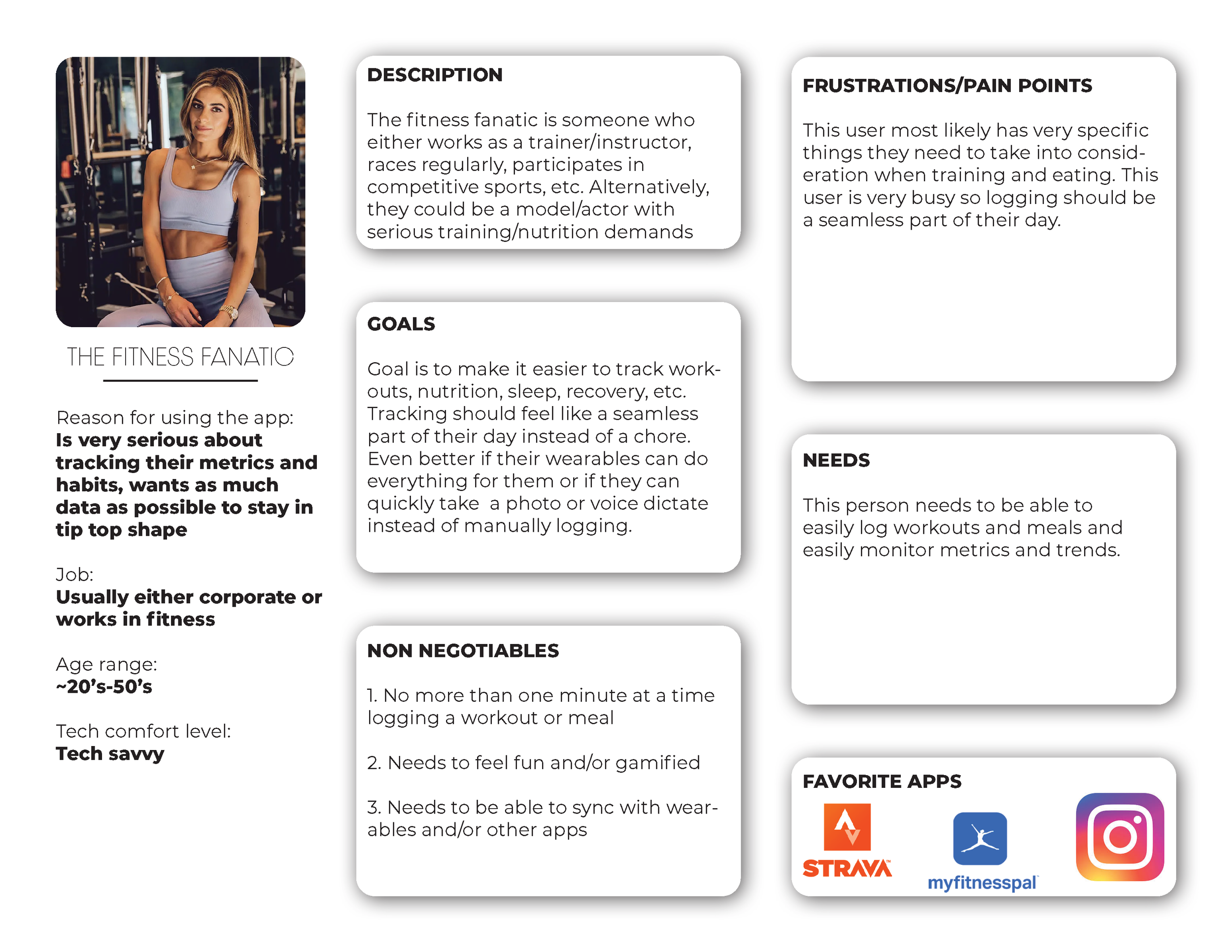
Personas
My two main personas for this project are the Fitness Fanatic and the Busy Professional

Flows
It was imperative for me that this app is intuitive to use, and makes logging workouts feel like a fun, rewarding thing to do that seamlessly gets to do during a workout rather than feeling like a chore.
User Flow

Task Flow

The Look
I’m inspired by Nike’s bright, inspiring campaigns. Fitness is so personal and often a sensitive, intimidating subject.
I wanted to make this app feel friendly, fun, and as if
logging itself is the reward.


Key Screens
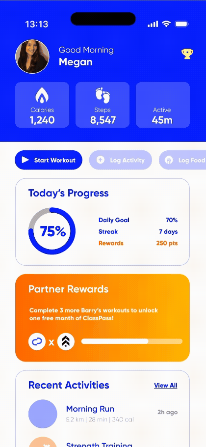
I wanted the user to immediately feel encouraged upon opening the app, so I wanted to show them their progress overtime upfront.
This screen displays their daily calories burned, steps, and activity time. Instead of other apps which tend to shame the user for being under their average daily metrics or who are taking longer than expected to reach a goal, my interface is welcoming and gentle.
The user can easily access all relevant data within any given time frame. The more wearables and apps connected, the better.
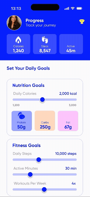
The user should be able to get as granular and detailed with their goals as possible. The more specific, the better, and the better for my app to guide them on their journey.
This screen makes it easy for the user to set goals, and our app will automatically combine them with other provided metrics and details to come up with a plan of attack.
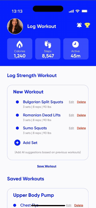
This screen will begin the workout logging flow. The user has the option of either manually logging a workout, connecting a wearable, choosing a previous workout, choosing a workout from a popular fitness studio, or using AI to follow them on their journey and using predictive generative technology to log their next workout.

Conclusion
As an avid gym goer and pilates instructor, I really enjoyed this project because this is something I would absolutely use and recommend to fellow athletes and trainers. I’ve never used a fitness logging app that had an easy way to track gym workouts (or really anything other than a cardio workout).
This app not only easily allows the user to log any type of workout, but its data analysis and stress tracker really levels it up.